News about rebranding, i.e. changing the image or corporate style, attracts a lot of attention. This generates interest among audiences but their assessments can differ dramatically: some support the desire to follow trends and fashion while others criticize it for what they see as a pointless waste of money.
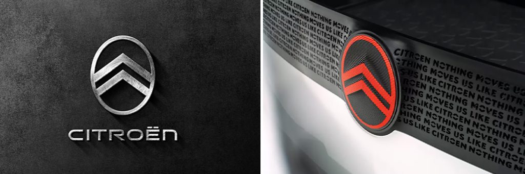
Either way, a logo renewal is a significant event that cannot be overlooked. Particularly when it comes to the new (or not so new) logo of the Citroën automobile company. Indeed, the recent change of composition almost exactly repeats the look of the original logo designed back in 1919 by the company’s founder André Citroën. The double chevron placed in an ellipse symbolizes the toothed gear with an oblique profile, a revolutionary technology that has changed automotive construction.
In more than a century of existence, this logo has been changed 13 times. The last rebranding took place in 2009 although the distinct ellipse around the double chevron has been missing from the composition since 1959. Now, audiences can enjoy a revamped logo that’s just part of a major rebranding exercise. In fact, Citroën has also announced a change of corporate identity and policy.

All materials on this site are copyrighted, including design and decoration. It is prohibited to copy, distribute (including by copying to other sites and resources on the Internet) or any other use of information and objects without the prior consent of the copyright holder.
It is also prohibited to include the content of the pages of this site and other objects located on the art-studiott.com. server in the structure of other sites (for example, by iframe or putting direct links to objects, including photos).
Any other actions, as a result of which Internet users may get the impression that the submitted materials are not related to the domain art-studiott.com., are prohibited.
You can place a link to a site page if the name of the link corresponds to the name of the page to which the link should lead (title) - there are the link codes at the bottom of each page.
 Art.TTimes@gmail.com