A logo is the most important visual element of a brand and corporate identity. It carries the values of the company, corporate identity and directly affects the popularity or recognizability of the brand. Therefore, choosing the right logo is an important step in shaping the image and brand as a whole. Often, the logo is the starting point for the full development of the corporate identity: design possibilities, design elements, color palette, illustrations and much more.
If you are rebranding your company or creating a brand from scratch, this article will help you understand the types of logos, their characteristics, and which logo is best for you.
Based on the type of composition and scheme, logos can be divided into several general categories. However, the same categories can have different names; therefore, for better understanding, we will point out the most common logo names:
1. Text logo (font, word, typographic logo)
2. Graphic logo (trademark logo, abstract logo)
3. Logo illustration (character logo, mascot logo, mascot logo)
4. Logo Monogram (Logo Abbreviation)
5. Company crest and emblem
6. Combined logo
It is worth remembering that a brand is constantly evolving. Almost all companies rebrand and redesign their logos. Therefore, logos can change and move from one category to another. You can read more about branding and rebranding in our blog. In addition, you can divide logos by technique of execution, style, color scheme, shape and so on. In this article we will describe each type of logo, its advantages, disadvantages and features in detail.
It is not hard to guess that this type of logo consists of letters written in a special font. In general, this is one of the most common logo types that can be used for absolutely any brand or company. That is why its versatility is one of its main advantages. Usually, a text logo is an artistic spelling of a company’s name. If you want to emphasize the name or company name when promoting your brand, this type of logo is perfect for you. However, you should carefully study your target audience, because often a text logo is inferior to others in terms of expressiveness and recognizability.
Who is suitable for this logo?
Text logo is universal and will suit any company. Nevertheless, text logo requires full development of the brand and comprehensive promotion together with corporate colors, music, images. In this case, the name of the company and the logo will cause associations with people and find a response.
Among the most famous examples of such logos are: Coca-Cola, Google, Sony, VISA, Nokia, Ford, Johnson & Johnson, Samsung.The right font will help to show the main advantages, “character traits” of the company. For example, creativity, rigor, modernity, reliability, emotionality.
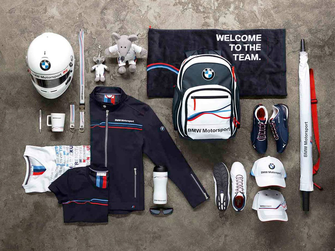
This is a symbol or abstract image, a composition of lines, shapes and contours associated with a brand. Such a logo can be associatively or directly related to the services and goods of the company, as well as to the name of the brand. The most famous companies with such logos are Apple, Microsoft, Adidas, Nike, Škoda, Mercedes-Benz, Citroën, Pepsi.
Often such logos are characterized by a very simple composition and color scheme (or its complete absence). Avoiding complex shapes and colors allows you to make the logo more recognizable. If you find a balance between simplicity of forms and originality, the graphic logo becomes the most recognizable type of logos.
Another advantage of abstract and simple logos is their versatility and flexibility. They are perfectly adapted for use on different surfaces (metal, wood, fabric, plastic, leather), as well as for different methods of application (engraving, milling, chasing, printing, embossing, screen printing). At the same time, simple logos remain legible and recognizable even on a small scale.
Who would use such a logo?
Judging by the name “trademark logo” you can understand that it is perfect for brands, manufacturers of goods, chains of stores and other businesses where the logo is directly applied to the product or is an important part of the design. For example, Nike and Adidas logos have become part of the design of clothing and footwear. In addition to being printed on textiles, shoes and other products are often complemented with logo-shaped inserts made of various materials. Abstract logos of many car manufacturers (Škoda, Citroën, Mercedes-Benz, Subaru, Mazda, BMW, Mitsubishi, Opel, Renault, Mazda and others) are also used in the finishing of car bodies, windshields and interiors. That is, they are applied to wood, metal, plastic, leather, fabric and other materials. And the Apple logo in the form of an apple is applied not only to smartphones, but also to other products of the company. This makes the logo an indispensable part of the company’s branding and promotion.
However, graphic logos have their own peculiarities and requirements. First of all, it is the complexity of creation. It is the simplicity of forms and composition that makes the creation of an original, aesthetic and recognizable logo a difficult task that can be solved only by professionals. In addition, the layouts of such a logo must be optimized for different programs and methods of use (for laser engraving, 3D printing, screen printing, etc.).
Another consequence of a concise composition – it is impossible to fit a lot of information and meaning into the logo. This forces to concentrate on a single image of the most important values. And also pay a lot of attention to the branding strategy.
Unlike a graphic logo, an illustration has a complex composition, a mass of details and shades. This makes this type of logo very expressive, bright and artistic. Bright and unusual logo illustration with a branded character will be a great face of the company in the field of entertainment, services, catering, children’s products or simply in the sphere associated with bright emotions.
Since the logo mascot can playfully convey certain emotions associated with the service or product, it helps to promote the brand more actively and create an original, recognizable style. After all, such a logo often already has the basic colors and elements of the corporate style, as well as a unique character that can be used in advertising or the production of souvenirs.
For whom is such a logo suitable?
As already written above, the logo illustration is a good choice for business areas related to emotions. That is, tourism, entertainment, restaurants and cafes, as well as everything related to children (toys, educational and entertainment institutions, children’s goods, clothing, etc.). In addition, such a logo is perfect for kindergartens, zoos, studios, food manufacturers and other companies that have a “prototype” of the brand character (mascot). The most famous brands are Duracell, KFC, Pringles, Michelin, Nesquik, Duolingo, DreamWorks, Metro Goldwyn Mayer. It is impossible not to mention The Walt Disney Company and its character Mickey Mouse, who, although not depicted in the logo, has become an important part of the company’s brand and even of global pop culture.
This logo consists of initials or an abbreviation of the name of the company and brand, created in an artistic style. Sometimes there are other elements besides letters, but they have an additional function that helps to reveal the main meaning. The monogram appeared in ancient Greece and helped to identify cities and manufacturers more than 2000 years ago. However, at the beginning of the XX century monograms gained new popularity and were actively used in branding and personal style of many companies of different spheres.
The advantages of monograms are elegance, aesthetics, grace, variety of styles and versatility. The difference between a monogram logo and an abbreviation logo is that the abbreviation is linked to the name of the company, while the monogram is directly linked to the name of the founder, which became the name. For example: Rolls-Royce, Louis Vuitton, Coco Chanel, Dolce & Gabbana, Yves Saint Laurent, Bentley. Such brands are strongly associated with the personality, character and achievements of the founder. This feature of the monogram logo is often used in branding strategies.
Who would use such a logo?
Since the monogram is the founder’s initials, the monogram logo can be a universal symbol for several directions. For example, if you want to start a business or register a trademark, a monogram would be suitable to combine a variety of present and future directions. A monogram logo is also the best choice for personal brand owners.
Similar to a graphic logo, a concise and elegant monogram is very recognizable and looks great on different sizes and surfaces (accessories, clothing, jewelry, packaging). However, it can also look more artistic and graceful. This is one of the most striking differences of this type of logos. A beautiful monogram logo is associated with prestige, refinement, luxury, premium. Therefore, it will perfectly emphasize the high level of your goods or your artistry.
Along with this logo abbreviations are exactly associated with the image of the company and its activities. That is why such logos can often evoke several associations at once. For example, Warner Bros., H&M, IBM, HBO and Volkswagen have completely different lines of business, but they all have a logo abbreviation that reflects their field of activity.
It is very important to realize that the logo monogram gains its advantages when it is made in the original style, reflecting the main advantages of the company and brand. After all, this is what the monogram was created for. Even if you consider a monogram as a personal symbol for non-commercial use, uniqueness, artistry and the ability to reflect character are its main, paramount features.
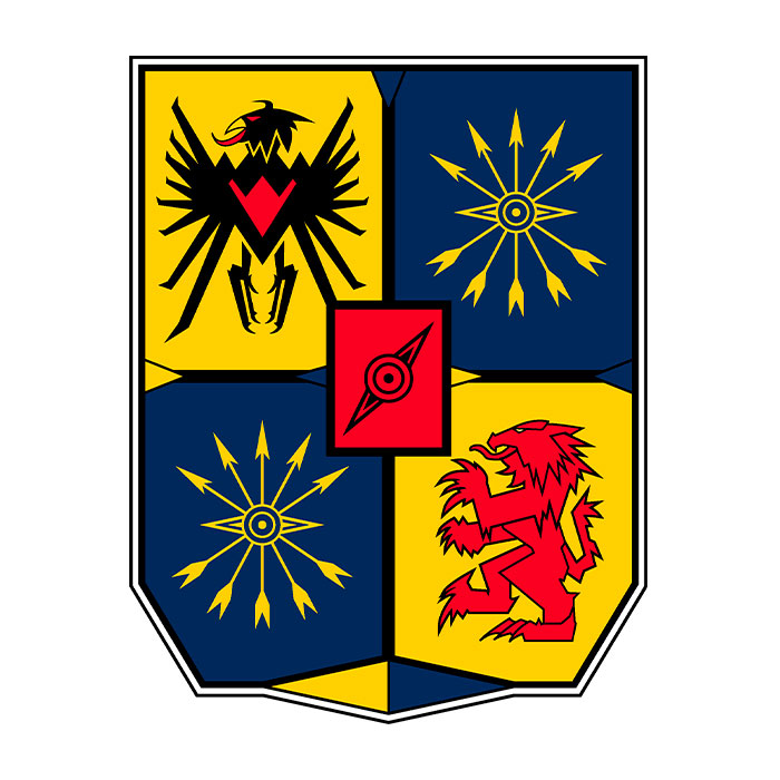
For centuries, a coat of arms has been a symbol of prestige, status, exclusivity and pride. Originally, the coat of arms of a family showed not only the title and noble origin, but also courage, bravery – the strengths of the ancestors and warriors. A company’s coat of arms can reflect not only its principles, advantages, history and mission, but also the personalities of its founders.
Compared to the other logos, the corporate coat of arms and emblem have the greatest amount of meaning and significance. This is due to the fact that each symbol can have several interpretations at the same time. In addition to the basic heraldic meaning, the symbol can be related to the culture of the place where the company is located, as well as directly to the life of the company’s founders or to the history of the company itself. In addition, the interaction of several symbols creates a new, unique meaning.
For example, the black horse in the Porsche emblem represents the strengths of cars: speed, strength, grace, power. At the same time, the raven horse on a golden field is the coat of arms of the city of Stuttgart, where the company’s headquarters and car manufacturing plant are located today. Stuttgart is the hometown of company founder Ferdinand Porsche and the capital of the German state of Baden-Württemberg. The crow-horse on the city’s coat of arms refers to the history of Stuttgart’s founding. According to legend, Count Luthold von Württemberg saw a fascinating horse during a hunting trip in the 10th century and decided to found the city on the spot. However, many historians call more probable version that the black horse is a symbol of the horse farm that served the development of the city.
In the past centuries, the coat of arms of the founder almost always became the main symbol and distinguishing mark of his business. The coat of arms was used on packaging, buildings and as a seal on documents. Today, you can find brands that use only some elements of ancestral heraldry in their logo (for example, the Nestle logo shows a nest with birds – a symbol of the family coat of arms of Henri Nestle) or territorial heraldry (the well-known BMW logo, often called a stylized propeller, actually refers to the company’s place of origin – Bavaria; white and blue rhombuses are still depicted on the flag and coat of arms of the federal states).
For whom is this logo suitable?
A logo in the form of an emblem or corporate coat of arms is suitable for companies that want to show their historical origin, prestige, image, seriousness, thoroughness and respect for tradition. This is especially true for companies engaged in the production of elite goods (alcohol, jewelry, weapons, literature, clothing, furniture, etc.). Since the shield – the main element of the coat of arms – is associated with protection and defense, emblems and corporate coats of arms are perfect for the spheres of law, defense, security, medicine, construction, finance. It is impossible not to mention and educational institutions, where the coat of arms occupies a separate, honorable place. For example, private schools, colleges, institutes, academies and universities.
The main symbols of football clubs are often called emblems. This is due to their meaning and composition, which often includes heraldic or cultural symbols. Creating a football club symbol requires a special approach. We have written more about the branding and rebranding of football clubs here.
Corporate logos as the main brand symbol can be found in such global brands as: Porsche, Twinings (one of the oldest logos in the world, dating back to 1787), EdmonddeRothschild, Château De La Ligne, Prinz Von Hessen.
An emblem differs from a company’s coat of arms in that it has more leeway. In heraldry, there are a number of laws according to which a coat of arms should be created, as well as a list of heraldic symbols. On the emblem any symbols can be displayed in any composition, which allows you to add artistic diversity while maintaining the style of the coat of arms. Emblems are used by brands: Starbucks, Alfa Romeo, Château Roubine, Dom Perignon.
When designing a corporate coat of arms or emblem, you should take into account that a large number of details and symbols may not be read well on a small scale. Therefore, if you plan to use a small symbol frequently, it is better to develop several versions of the corporate emblem. A large, detailed version of the logo is suitable for printing, decorations, souvenirs. And a smaller and simplified version will look great on jewelry, accessories, tags, caps.
A composite logo is a combination of several types of logos, most often text and graphics, in a single composition. In this case, the text and graphic parts can be used separately, while maintaining the recognizability of the brand and images. Such a logo combines the versatility of the text type with the artistry of the graphic type. However, the final composition, which is logical, has a lot of details, so it is not always suitable for small-scale use. Often for printing, advertising, souvenirs and other applications of the logo, where it can be represented in a readable size, a full version of the combined logo is used. And for packaging, labeling, design (including web design), and native promotion, use the graphic part of the logo.
Who is this logo for?
In general, a combined logo will work for almost any business. If you can’t decide between an abstract image and text – combine them. The variety of styles and artistic techniques allows you to convey the mood, images and benefits of the brand. That is why you can find the combined logo in many brands: Adobe, Amazon, Walmart, Red Bull, The Walt Disney Company, Android, Fanta, PayPal.
Regardless of the type, every logo should be legible, recognizable, unique, and symbolic of the company. It’s also important to use the brand symbol correctly so that it adds value. Creating a logo is a process of studying the company, its priorities, customers, products to create a symbol that will strengthen the bond between the company and its audience. That’s why we analyze the company and the product and do a consultation on all types of logos in our art studio.
If you can’t decide on one type of logo, you can create several variations of the same concept or several fundamentally different symbols of your brand. This will expand your branding options and make your brand more cohesive. But even choosing a logo is an important step in building a company’s image and brand. At Traditions of Time, we are dedicated to developing and promoting thoughtful designs that emphasize uniqueness and meaning. We have over 15 years of design experience and a large number of completed projects around the world. We should mention that we are leaders in the design of heraldic symbols (family, territorial and corporate crests, emblems, as well as personal, family, wedding and corporate monograms) and are familiar with all the intricacies of heraldic rules.
You can see our work in our portfolio and get a free consultation from our specialists. Moreover, we are engaged in the development of not only symbols, but also the brand as a whole. This will significantly save your resources and help you make yourself known to the world.

All materials on this site are copyrighted, including design and decoration. It is prohibited to copy, distribute (including by copying to other sites and resources on the Internet) or any other use of information and objects without the prior consent of the copyright holder.
It is also prohibited to include the content of the pages of this site and other objects located on the art-studiott.com. server in the structure of other sites (for example, by iframe or putting direct links to objects, including photos).
Any other actions, as a result of which Internet users may get the impression that the submitted materials are not related to the domain art-studiott.com., are prohibited.
You can place a link to a site page if the name of the link corresponds to the name of the page to which the link should lead (title) - there are the link codes at the bottom of each page.
 Art.TTimes@gmail.com