Proper design on the packaging of goods and products that you like creates a pleasant emotion and experience. More often than not, fans of a particular product do not think about why they have chosen this particular one among similar products, they just like the way it looks. People perceive up to ninety percent of information visually. Do you think this is a reason for creating a visually appealing product? The question is rather rhetorical, the answer is obvious. A design “works” because an object with an interesting packaging wants to be picked up and examined whereas an inconspicuous design doesn’t attract attention. Yes, such a product will have its admirers but its promotion will be much slower.
McKinsey&Company, an international consultancy, has years of experience and works with major companies around the world. A few years ago, the company became concerned about research into how design affects profits. Such a chain is not easy to trace, a lot of different data was collected. McKinsey&Company was able to explain how the appearance of a product, the way its packaging looks, affects the popularity and attractiveness of the product to customers.

Your service or product must be competitive, both in its quality characteristics and its visual appeal. This combination of qualities will not go unnoticed. Illustration-based design, for example, opens up many possibilities. The main thing is to know what you want to achieve, what aspects of your product or service you want to show. Packaging design works very interestingly when there is a life story behind it.

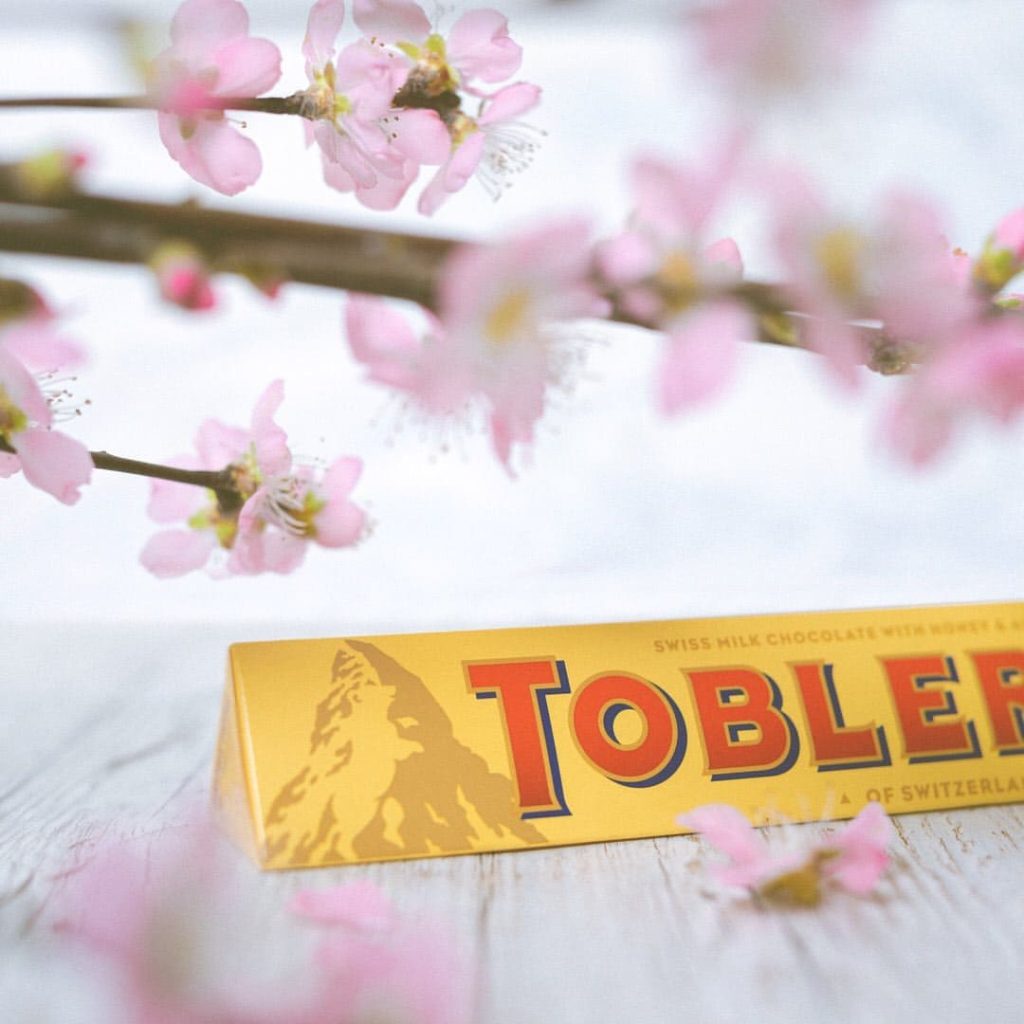
The Toblerone brand that produces delicious Swiss chocolate has a history of its own. This chocolate needs no special introduction but still, it is necessary to explain what it is all about. Theodore Tobler’s father, Jean, happily owned his own confectionery shop as early as 1868. Things were going well with the sale of sweets but Jean Tobler was not the manufacturer; at the time, he was only selling sweets from other confectionery factories. As the chocolate business was a success, Jean decided to open his own factory that he handed over to his son and nephew after a short time. The young men became a great team. The chocolate needed an original recipe for the shape and design of the packaging all of which the brothers coped with perfectly.
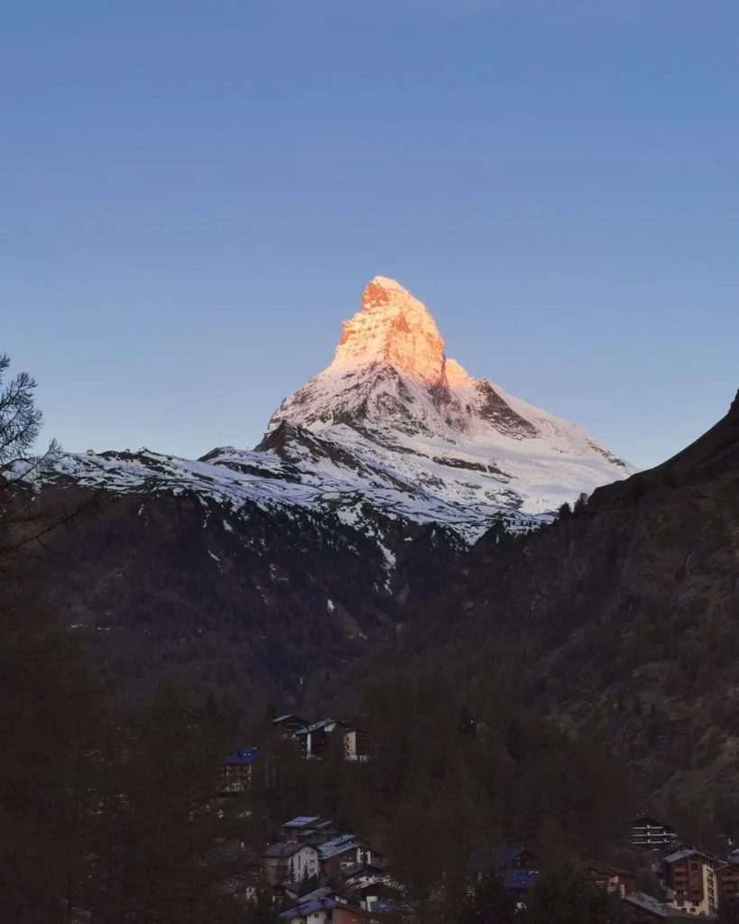
To start with the recipe, the chocolate contains almond nougat. This delicacy comes from Italy and is called a turrone. The youngsters developed a unique way of using almond nougat in the chocolate recipe. The brothers also realized the idea behind the shape of the chocolate bar in the form of repeating triangular slices. There are several versions of why Toblerone has a triangular shape. One of them says that the Matterhorn was the inspiration for this particular kind of candy bar. The illustration of this beautiful mountain on the chocolate packaging looks great. Although the Matterhorn logo appeared on the packaging later, it is perceived as if it has always been on the chocolate packaging. In this case, with the development of packaging design and creation of illustrations we did not have to think much, nature had done everything much earlier, it was only necessary to repeat the masterpiece (Matterhorn) on paper beautifully and competently. But nevertheless, there is a secret, you have to look closely and the illustration of Matterhorn will open from a new side, you will see the drawing, or rather the outline of a bear. So, the importance of packaging, label and logo design is not exaggerated, the main thing is a competent specialist and the right approach and luck.
We see the end result of years of work, a delicious chocolate that also looks unusual, with an illustration of the Matterhorn on the packaging and a name that makes sense. The surname of the chocolate factory’s founder and successor, Toblerone, is a particular ingredient in the recipe for Turrone chocolate, combining the two to form the name Toblerone. But we know only partially how much time, effort, experimentation, trial and error is behind this result. In the case of Toblerone, a few ingredients for success can be identified, such as a successful recipe, shape, packaging or label design, and an illustration that harmonizes with the product. In fact, the illustration of the Matterhorn is the logo of the chocolate because when we mention Toblerone, in addition to its shape, we immediately see the image of the Matterhorn. And those who have been within the confines of this poetic mountain recall images and sensations of breathtaking beauty. So the conclusion is obvious: choose carefully what you want to communicate to your customers, what emotions you want them to feel with your labels, packs and design in general.

It is no accident that the Matterhorn has a bear on it, a tribute to the home town where chocolate production began. The name of the town is Bern, and the bear is depicted on the flag and on the coat of arms of Bern. It was there that the chocolate factory was opened.
Photos taken from the Instagram resources of Toblerone Chocolates and the Zermatt Visitor Centre.

All materials on this site are copyrighted, including design and decoration. It is prohibited to copy, distribute (including by copying to other sites and resources on the Internet) or any other use of information and objects without the prior consent of the copyright holder.
It is also prohibited to include the content of the pages of this site and other objects located on the art-studiott.com. server in the structure of other sites (for example, by iframe or putting direct links to objects, including photos).
Any other actions, as a result of which Internet users may get the impression that the submitted materials are not related to the domain art-studiott.com., are prohibited.
You can place a link to a site page if the name of the link corresponds to the name of the page to which the link should lead (title) - there are the link codes at the bottom of each page.
 Art.TTimes@gmail.com